El "Tube" del metro de londres
Connections
By Brian KerrI’m just starting to get this blog up and running and have created a simple banner inspired by the London Underground Map. I grew up in London and have always had the underground map as my mental model of the city. It also has so many ‘connections’ with the kinds of topics I want to explore on this blog, particularly the somewhat amorphous but maturing area of User Experience.
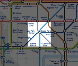
I chose to focus in on Green Park station, a central part of the map where three lines join. The station is highlighted in orange to focus on the magic (or often the pain!) that can occur at the intersection of my three alternative lines of People, Design, and Technology!
If you are interested in the history of the design behind the London Underground map then carry on reading for some notes I’ve made on the subject. There are a few pictures so you could just see the quick 5 second graphical summary just by scrolling down quickly!
Design of the London Underground
Frank Pick was put in charge of publicity in 1907 and five years later became the commercial manager of the London Underground. He put in place many changes to the overall design and look of the system which in it’s early days was quite confusing with commercial advertising all over the place.
Frank wanted to create a modern, clean, consistent and purposeful system through the unity of design. He did so by coordinating all aspects of the design including the station architecture, interior design, fabrics, logos, typeface, posters, etc.
The Logo
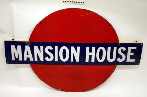
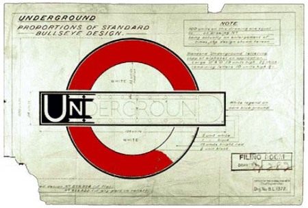
The Roundel logo was used from 1908 and first consisted of a solid red disk with a blue bar across it. These signs were used consistently on all stations and gave them a clear identity, distinguishing the station from all the other competing advertising clutter.
Afterwards the typographer Edward Johnston adjusted the Roundel Logo to be the bullseye symbol that is used today a hundred years later and has become not just symbolic of the London Underground but of the city itself.
The Typeface
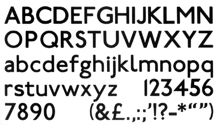
Edward Johnston designed this clean, easily legible, sans serif typeface in 1916 especially for the London Underground.
- The ‘O’ is a perfect circle like the logo
- The dot on the ‘i’ and ‘j’ are diagonal squares
(similar to the diamond station symbols first used on the tube map 20 years later!)
The Map
The tube map defines a shared mental model of London for the people that live here and for those that visit. It is often the first map used to plan journeys rather than a traditional physical map and so it is the User Interface to the city to aid planning.
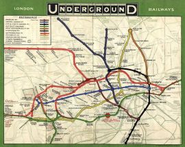
The first maps were just normal maps with the position of the underground lines superimposed. As the underground system grew this became more difficult to represent in an understandable way. The example below is from 1908 and is one of the earliest maps to show how the various services connect.
Harry Beck
Harry Beck had been working as an electrical draughtsman for the London Underground and was out of work when he produced the first sketches of the map that we are familiar with today. He was only 29 and worked in his own time on his own initiative. When he first offered it to the management it was rejected as being too radical, but he persevered!
Harry understood that the order of the stations and the connections were the most important things and that the actual geography and distance between stations is less important when you are travelling underground.
Harry was used to drawing circuit diagrams like the one below.
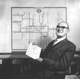
It is no surprise then that when Harry applied his working knowledge of circuit diagrams to the tube map that he came up with the wonderfully elegant schematic map. Below is a picture of Harry Beck with his map.
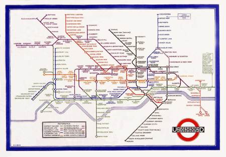
Here is a closer view of his breakthrough map in 1933
A Design Classic
The map has managed to evolve and adapt to change as needed and is still used relatively unchanged over 75 years later. It was recently celebrated as part of the Royal Mail – British Design Classics stamp collection in it’s modern form.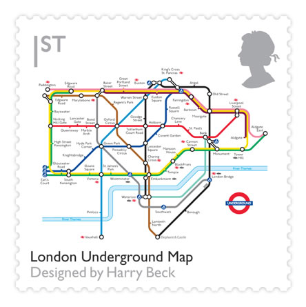
BBC Design Classics Documentary
The following BBC documentary tells the story behind the London Underground Map.
Influence on other underground maps
Nearly every underground map in the world has taken inspiration from the ideas in Harry Beck’s 1933 design and can also be seen in other transportation maps, such as trains, boats, planes, etc.
Inspiration for representing knowledge
The Great Bear
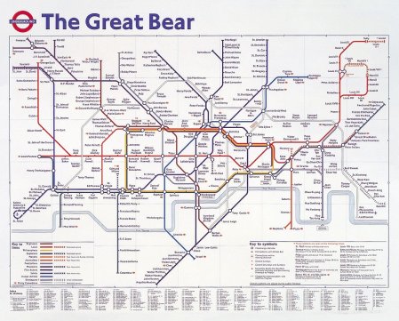
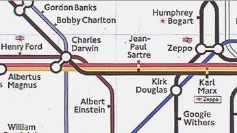
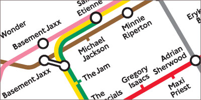
The artist Simon Patterson created the rather playful work of art called The Great Bear in 1992. The title refers to the constellation Ursa Major while the map has his own arrangement of “stars”. The lines represent different kinds of people such as Philosophers, Actors, Artists, Politicians, Footballers, etc. The fun really happens when you look at some of the people that exist at the interconnection of the lines.
Web Trends 2009
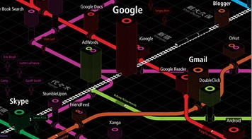
iA Japan have for the last four years produced a map of Web Trends. Their latest map for 2009 can be downloaded from here.
Guardian Map of Music
The Guardian Newspaper produced a similar map for musicians. The full map can be downloaded here.
Inspiration for art
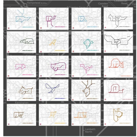
Animals on the Underground
Paul Middlewick first started to spot Animals On The Underground in 1988 and the number is always growing.
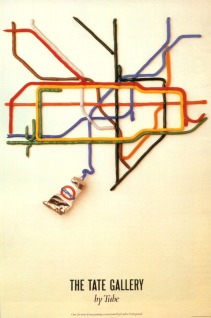
Poster for The Tate Gallery
In 1986 David Booth created this poster for The Tate Gallery depicting the map as paint being squeezed out of tubes.
The art world has also taken Harry Beck’s tube map as a source for inspiration and taken it in many abstract directions. They are often used on the cover of the free paper pocket version of the tube map available at all stations. Here are a couple of examples.
Cornelia Parker
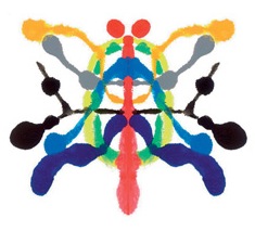
Cornelia Parker produced Underground Abstract which took as a starting point the poster above and then imagined it folded in the style of Rorschach Inkblots.
 David Shrigley
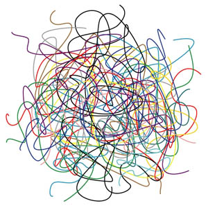
One of my favourite bits of art based on the tube map is this spaghetti version by David Shrigley.
Connections
Well that’s some of the connections that come to mind when I think about the London Underground Map. There must be many others.
What are your favourites?
Labels: color, diseño grafico, grafica, ilustracion, logos, marcas, videos


0 Comments:
Post a Comment
Subscribe to Post Comments [Atom]
<< Home